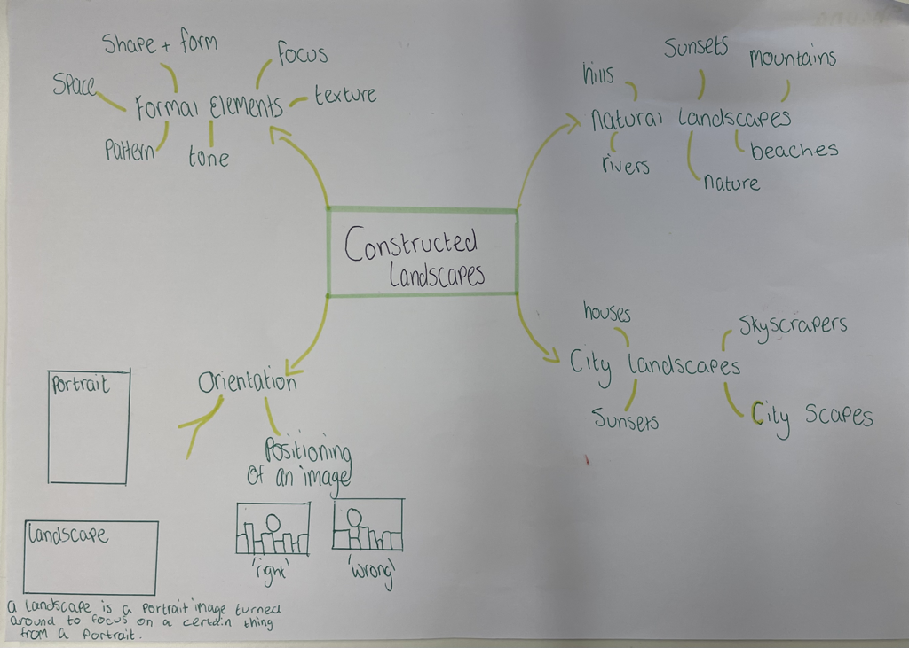
What is a landscape picture?


When I hear the word landscape I imagine a pretty view of a sunset or an image picturing nature and the real world.
A list of words that pop into my head that associate with a landscape would be;
Sunset
Mountains
Hills
Beach
Pretty
Garden
Drawing
Scenery
Night
Flower
Lake
City
My ideal landscape would be an image of a sunset on a beach as those images are very pretty and it shows a nice aspect of nature
I like images of the sunset as they are always different as everyday there will be different views and colours.
When I look outside my window I have the view of my back garden and the road that is behind mine I have a view of their garden too I also see a lot of trees and nature in my garden and in the surrounding areas of my garden.
I have taken landscapes images before they are images of a sunset at a beach
Tanja Deman


Tanja Deman's images are very interesting as she has constructed all different types of images to become one image.I personally like her work as it looks all natural as if that is an actual image that she has taken and not multiple images that she has put together.I also like her work as it can make you question what is actually going on in all of these images as it looks like there is some sort of conflict or war going on in all three images for example it looks as though the buildings are being blown up in the third one.Here I can see that she has taken all different types of images and cut them and put them back together again to make a collage.My favourite image is the first one as it looks like she has taken multiple images and put them back together again to form one I like this image as the black and white adds an effect on it and can make you question what the images were to look like if they were in colour.
My response


This is my response to Tanja Deman’s work here I took 3 or 4 different landscapes cut them up and put them into a collage I personally like my work here but you can see how I have cut and stick these images whereas in Tanja Deman’s her images look real and they do not look like they have been cut and stick like mine do.When I decided to do this I thought about having a mountain overlooking some buildings and then also I put a passing train in the bottom left to add an effect.
After I had done this I printed the collage onto acetate which is the image in the middle,I then took it into the dark room and made a negative copy of this image I liked how both of these turnt out but i’d say that i prefer my negative image more as it shows the mountains and tall buildings very well but the smaller buildings are not shown as much.
Using the acetate again I made a cyanotype, making this we had to lay our collages over a piece of cyanotype paper and layed it in the sunlight for around 6-7 minutes then brought it back inside to wash it off and let it dry. As you can see on my cyanotype it got a bit over exposed with the sunlight and did not turn out how I wanted it to.
Out of focus landscapes
Uta Barth


Uta Barth is a contemporary German-American photographer whose work addresses the themes of optical illusion, perception and non-place.
The 3 images above show some examples of Uta Barth's work I personally like her work as it can make you question it for example we do not really know what the second image is and it makes you think and make up an image in your head as you wonder what the image would look like if it was in focus. These images also being out of focus can make you question as to what they would look like, I like that they are out of focus as it adds an effect on them for them to stand out. Some words I would use to describe her work would be abstract and concealed as all of her images are out of focus and that is not normal as in images there is usually at least one thing in focus.I can see that she has either edited these images to add the blur and out of focus or she has taken these whilst her camera was not focusing.I can also see that in the middle and last image they were taken at dusk as they look as if they were taken just before the sunset.I can also see that she has chosen to focus on roads and cars.There is also a focus on light as in the first and last image there are the headlights of the car and in the middle image the light shining through is from the traffic lights.
The 3 images above show some examples of Uta Barth's work I personally like her work as it can make you question it for example we do not really know what the second image is and it makes you think and make up an image in your head as you wonder what the image would look like if it was in focus. These images also being out of focus can make you question as to what they would look like, I like that they are out of focus as it adds an effect on them for them to stand out. Some words I would use to describe her work would be abstract and concealed as all of her images are out of focus and that is not normal as in images there is usually at least one thing in focus.I can see that she has either edited these images to add the blur and out of focus or she has taken these whilst her camera was not focusing.I can also see that in the middle and last image they were taken at dusk as they look as if they were taken just before the sunset.I can also see that she has chosen to focus on roads and cars.There is also a focus on light as in the first and last image there are the headlights of the car and in the middle image the light shining through is from the traffic lights.
Bill Armstrong


Bill Armstrong is a New York based fine art photographer who is known for his out of focus coloured images.
The 3 images above are some of Bill Armstrong's work, in the first image we can see a figure of a person who looks like they are stood in front of a sunset or sunrise as the sky behind them is very orange and slightly red.In the middle image I can see another figure that also looks like they are in front of a sunrise or sunset as the sky behind them is very pink, I can also see something in the background that looks like a mountain with the person stood the right of the image to show the background more and making a 'wrong' landscape with the main focus not being in the middle but being to the side instead. In the third image I can see a person who has been distorted with the blue background this can also interpret that the person is underwater or in the sky due to the blueness.It also looks like the person is maybe dancing as there arms are up and they are in a certain position to make it look like they are spinning.
The 3 images above are some of Bill Armstrong's work, in the first image we can see a figure of a person who looks like they are stood in front of a sunset or sunrise as the sky behind them is very orange and slightly red.In the middle image I can see another figure that also looks like they are in front of a sunrise or sunset as the sky behind them is very pink, I can also see something in the background that looks like a mountain with the person stood the right of the image to show the background more and making a 'wrong' landscape with the main focus not being in the middle but being to the side instead. In the third image I can see a person who has been distorted with the blue background this can also interpret that the person is underwater or in the sky due to the blueness.It also looks like the person is maybe dancing as there arms are up and they are in a certain position to make it look like they are spinning.
My response


This is my response to Uta Barth's work I personally enjoyed doing this work as it was fun to play around with how in and out of focus I could make an image.This piece was quite simple to recreate.I think that I could have taken more of these images to add to my selection of images.I enjoyed this because it was quite simple to do and I liked taking the pictures out of focus as it can create an effect on them
Dionne Lees
Drafts from Dionne Lee on Vimeo.
Minimalist landscapes.


The first image is the image I used to make a minimalist landscape this was a image that I had printed from a book.
I personally didn’t like my work here as I did not really make it into a landscape I cut out random shapes and tried to experiment with it but I did not like it in the end as it did not look how I would have like it to. To improve this piece of work i could have tried to do it again and cut things out to make it look like a landscape image.I liked doing this piece of work as it was fun to playb around and cut things out but I should not have cut out random shapes and instead cut out things to make it look like a landscape.
I personally didn’t like my work here as I did not really make it into a landscape I cut out random shapes and tried to experiment with it but I did not like it in the end as it did not look how I would have like it to. To improve this piece of work i could have tried to do it again and cut things out to make it look like a landscape image.I liked doing this piece of work as it was fun to playb around and cut things out but I should not have cut out random shapes and instead cut out things to make it look like a landscape.


To create these photograms I used the image above for the photo gram on the left.I did not like how this piece of work as it had just looked like I had cut out random pieces of the image.The image on the right is my collage that i had made in the Tanja Deman work, I had tried to be a bit more creative this time and make it look like I hadn’t cut out random objects from the image where as now it had looked like I cut out a tree and 2 small buildings.The image in the middle shows where I had took some photographic paper and placed some cut out images on top of it to try and create a landscape looking image I think that I could have done this part a bit better as the objects looked like I have just placed them down randomly without any thought behind it.
South London gallery trip


Peckham photo walk


Dafna Talmor


Dafna Talmor is a London based artist who specialises is constructed landscapes specifically disrupted landscapes images by editing them and taking them apart to put them back together again like a puzzle of some sort.In the first image above there is a few unusual things that make the image look very interesting for example we can see that the middle part of the image has been disturbed. At the bottom of the image we can see two black objects that have been cut out, they look like they are boats on the water that have been cut out of the picture.In the image on the right it looks like she has just taken one image and disturbed it or cut it up to put it back together to make one image again whereas the one on the left looks like 2 images that have been taken apart and put back together again.
Below is my attempt at disrupting landscapes on the first one that I had done I had used a scalpel and a pen to try and disturb the image I did not really have an idea as to what I was doing so I was trying to experiment to see how it would look, you can sort of see the black lines at the top which were from both the pen and scalpel but the lighter lines that you can see are from the scalpel.In the second slide I also used a scalpel to try and disturb the images but also used the coloured gel to put on top of the images to try and bring in some more colour to the images and to try disturb it even further.To get these images we used little slides to put the images in and then put them into the projector to blow them up and see how they looked as a normal sized image.
I think that I should have placed the coloured gel in other places to experiment more and try to make my work the best it could be.


Keith Arnatt


Keith Arnatt was a British conceptual artist. Above are 3 pieces of his work, I personally like his pieces of work as they look as if they all look as if they were taken from some abandoned or rural areas these images also look very old as they are in black and white and i like the effect that the black and white gives off it also reminds me of war times as in the third image i can see a beachy looking area but it is very rocky and looks as though there was a conflict of some sort there.I also like that the images do not have any people in them and just a couple of objects like the bins/metal cans that are in the first 2 images.These images make me feel a sense of curiosity as I do not know where they were taken or why the artist decided to make images like this.I am guessing that these images were taken in a rural or coastal area near a beach.I can see that Arnatt has taken these landscapes and then decided to put them in black and white to add an effect to them.These images also make me question what they would look like in colour as i would wonder what season or time of year it is to see what the sky and grass look like.This picture is different from real life today as these images give me a sense of inner peace as there is not loads going on they are just images taken in a rural and peaceful area with no people or noise from traffic outside.In the third image the rocks that are close to the middle in a lie strike me the most as they look like a border of some sort but i am not sure as to what it could be a border to, it could be a border between land and water.
My attempt


Here is my attempt at recreating Keith Arnatt's images. My personal favourite is the first image as I like how the focus is on the benches in the middle and how the trees and clouds are sort of out of focus. I personally found this difficult as there is not many places near me that are rural near me so it was hard to take images like his ones. I think that I should have done some more research into where to go to to take photos inspired by him.I do not really like the images I took as I think that they could have been better if I was to look around more and find more places to take images like Keith arnatt's
Aletheia Casey


Aletheia Casey is a documentary based artist who works a lot around the environment.In the images above i can see how she has taken images of a tree taken them apart and has made a collage or disrupted them in a way as in the first image I can see that she has taken apart a landscape with a tree and put it back together but in blue and only focusing on the tree as the background is all black or a blue colour.I like her work as it reminds me of work that i have done before with the collages and taking things apart and putting it back together to form one image again.These images are also naturalistic as they are focused on a sense of nature and trees.I also like these images as they can also give you a sense of curiosity like Keith Arnatt's work as it can make you question as to why she has decided to disrupt the images in this way. I also like the third image as i like how the focus is on the flowers and how she has made it red and blue on the outside I also like how she has covered underneath the flowers to make the outline seem like a flower too.I believe that Aletheia Casey has used one image in the first photo and cut it up and out to form a new image with the tree still being the main focus.In the second image she has not really disrupted it that much she has just edited the image and blurred out one on the corners.In the third image she has covered the main focus of the image and either used chemicals or paint to create the background in the image.The part in the first image that strikes me the most is the right corner as it is all just plain black it makes you wonder what was there before she had taken the image apart.
My attempt


The images above are my base images that I have taken to experiment and disrupt.I decided to just focus on trees for my base and now I will go ahead and choose 2 or 3 of my favourite images and then continue to experiment and disrupt them.

Above is an example of my interpretation of Alethia Casey's work the image on the left is a digital image that I made on my phone by editing the image and drawing on it with the highlighter pen to draw on it and add colour to make it like Casey's work I did change it a bit as she used a red to disrupt her image and i decided to try and use blue and an orange colour as I used the highlighter pen you can still see the background slightly especially when I used the orange colour.I did not really like this one as it looks very messy and it did not turn out how I would have liked it to as I did not like how the orange blended with the blue I think that I should have used different colours when drawing on the image.I also do not like it as it is very messy around the edges of the plant. I do like how the blue covers the left hand side of the image as it can bring the focus to the plant in the middle of the image.


Above is another one of my attempts of Alethia Casey’s work. Here I took 3 separate images and put them together to create a collage and I then also added some coloured gel and added it onto the collage. I then photocopied the collage so it would all be smooth at first I tried it in colour but I was not sure if I liked it when it was in colour so I then copied it again but this time in black and white. I then found that I preferred it in black and white instead of colour as it looked very messy in colour. I quite liked to do this as it was fun to play around with my own images and see how I could further develop them.However I did not like how I did place the images and I think that I should have experimented slightly more before putting all the pieces together.I chose to use images of plants and trees as I was inspired by Casey’s work and I liked how her work turnt out but I was not so sure about my own interpretation.I think that I will refine these further by using either different images or using the same images and cutting them out differently to make it look better.I also preferred the black and white one as it looked better than the one in colour as the one in colour you could see all the different colours of the images whereas in the black and white it just looks better as it is different shades of black and white that just go together.
Dark room experiments


Above are images that I have made in the dark room.I done this by printing an original image of a tree onto acetate, then going into the dark room and using photographic paper to print the acetate onto and then developed it using the chemicals. In all three of these dark room experiments I had left the images in the chemicals for too little time and that caused them to have the blotches everywhere. Although this wasn’t meant to happen I liked the fact that it did happen as it reminds me of an old image on film that had been disrupted.
Making day
Below are images of all the dark room experiments that I have made. I made many different types of dark room experiments.The first image is the original image that I had used to do everything with, I printed that image onto acetate and went into the dark room and made positives and negatives and exposed them to the chemicals for different amount of times. I then experimented without acetate and just used the original image. I also decided to add on some objects whilst exposing the photographic paper to the light.There was also an accidental blur but I liked that as it added an effect.


Experiment 1


Above is one of my projects, here I have used the positive and the negative that I had made in the dark room and put them together as one image to make a collage and look as though they were mirroring each other.I then printed this off again and edited it on the printer to mirror it so it would have the image four times.I had then stuck this image onto mount board and printed off a smaller one to add on top, here I experimented as I didn’t know as to whether I wanted the trees to be aligned and for the image to look the same or whether I wanted to flip it like I did do in the image above. I also experimented further with this when I decided that I wanted it to stand out more by being more elevated, I done this by using small cubes of foam to stick onto the bottom image so the picture on top would be more elevated.
