


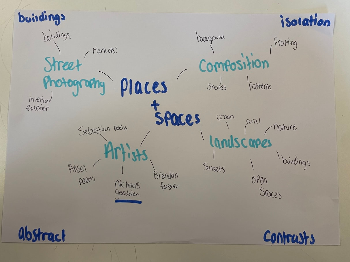
Places and spaces
Nicholas Goodden


Above are 2 pieces of Nicholas Goodden's work I like his work as I like the idea of street photography and taking pictures of street art. My personal favourite image is the second one as I like how the place looks almost abandoned and i also like how all the lights reflect and create lines to go through the image. I also like how in both images the focus is on the art and the colour of it and how he had edited his images to make the backgrounds seem boring to make the colours and graffiti stand out more.I have chosen to do places and spaces inspired by him as I like how he experiments with different types of places for example it look as though he is down an alleyway in the middle image whereas in the third image it looks as though he is in a high street or a place like that.
My response
I have been inspired by Nicholas Goodden to go out and take images of abandoned and isolated places I may then go on further to edit these on photoshop as with Nicholas Goodden's the first and second images look as though they have been edited to focus on the graffiti and colour and to almost make the background feel boring.I think I will respond to his work by taking images and making a collage or editing them on photoshop.


These are 2 images that I have taken in the past that I will begin to experiment with to make a response.


Here is a quick response I made to Nicholas Goodden above on the left is an image I got from the internet of the sky.In the middle is a photo that I took. To make this collage I used a scalpel to cut off the rest of the building in my photo to be able to put the picture of the sky on top. I then printed off the image of the sky in black and white and cut out the bit I wanted to use and then stuck it down on top of the building to make it look like the sky was already in the picture.As this was a quick response it was not very neat and the lines and edges are very messy but I personally like it as the black and white sky makes the actual image look better and makes the graffiti and colours stand out more as the sky is almost boring.I also think that the sky looks better than the buildings being there although one thing I did not like about the image was that as i had printed it off again it had lost some of the brightness and colours and it had made it look quite dull.


Above is one of my attempts at making a response, here I used an image and went onto photoshop and edited it.Firstly I put in the image in black and white so I could then go onto playing around with the brightness and contrast and getting it to how I wanted it to look like I then went on to mess around with the exposure of the image so it wasn't so bright and made the background a bit darker so the focus could be on the bridge I then went on to play around with the colour balance to play around and see if I could make parts of the image brighter. I then went on to use the selective colour tool and turnt the cyan and magenta up slightly to make the railings be more in focus.
Vera Lutter |
Catherine Yass |
|
Vera Lutters is known for her unique images representing nature and architecture. Her images look as though they have been made in a dark room with negative, I like her work as she has not exposed the pictures in the chemicals for too little or too long.
|
Catherine Yass is known for her distinctive photographic and film based work. Her images look as though they have been taken and then edited in photoshop, in the first image it looks as though she has put them onto acetate and cut scratched some of the image out and then put it into slides. I like her work as the colours go well with eachopther and add an effect to the image.
|


Comparison
I like how both artists work are slightly similar as they both have an image of buildings that look like they have been disturbed as the first image looks either edited or looks like it had been experimented with in a dark room whereas catherine yass' image looks as though it has been edited on photoshop.
Photo shoot linked to theme


Catherine Yass response

This was my first response to Catherine Yass' work, Here i printed of the image above in multiple different colours and put them together to make a collage, i like the colours that i used to experiment with but I do not like how there is just blocky lines from where I had cut the images.


Above are my photoshop attempts here I have taken 2 different images and manipulated them with all different types of tools. At first I added a coloured layer then went on to play with hue and saturation at all different levels to choose a colour that I had liked, after that I had played around with brightness and contrast to make the colours stand out some more I then experiemented with curves as that was something I had not seen before so I wanted to see what it would do to my images. I then experimented again and inverted the image and went on to do the same processes that I had done before


Final outcomes from photoshop


Vera lutter response


Here is my response to vera lutter, I copied my images onto acetate and went into the dark room and made multiple copies of my negatives, i tried to make the first one multiple times but it did not seem to work as well as the other image although in the second image there are blobs from where the acetate had lifted from the photographic paper. I will attempt to do these again and see if they turn out any better. The third one is the best one that i have made as it doesn’t have the blobs as the acetate has not lifted from the paper
